
 By
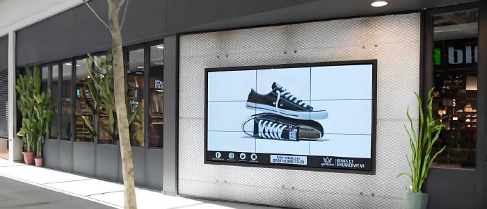
Designing a high-converting digital storefront requires a mobile-first approach, fast loading speeds, and a trust-focused layout that guides visitors to purchase. Key strategies include using high-quality visuals, clear call-to-action (CTA) buttons, and streamlining navigation. Key elements to prioritize include:
- Mobile-First Design: Ensure the store is fully optimized for mobile devices, as a significant portion of traffic comes from phones.
- Rich Product Visuals: Use high-resolution images, videos, and 360-degree views to increase buyer confidence and sales.
- Trust Signals: Build credibility with visible customer reviews, secure payment badges, and clear shipping/return policies.
- Simplified Navigation: Create an intuitive menu that allows customers to find products quickly without being overwhelmed.
- Streamlined Checkout: Simplify the checkout process to minimize cart abandonment.
Whether you’re an avid designer or a first time tech user, these design tips will help you create an online experience that people won’t stop recommending:
1. Optimize your storefront layout
Your storefront thrives when designed with the customer journey in mind. With digital channels driving over 54% of revenue today, a mobile-friendly storefront becomes more crucial than ever. Optimizing your storefront to meet your customers’ expectations and evolving market needs shows that you respect their time and choices.
Here are a few ways to do this:
- Use high-quality, low-compression images: Use high-quality product images with consistent elements and designs that are compressed for page speed.
- Place best-sellers on display: Put your best-selling products and promotions in areas where they’re easily seen and clicked.
- Simplify menu navigation: Design an accessible menu that lets shoppers quickly browse product categories and find items without feeling overwhelmed.
- Test different layouts: A/B test different layouts, buttons, and content placements to understand what’s driving better results.
- Have a mobile-first approach: Offer a seamless experience on all devices as customers browse and shop from their phones and tablets.
2. Maintain design consistency with storefront templates
The easiest way to keep your branding consistent across your storefront is to use a template. Storefront templates can make SMB owners more efficient as they provide pre-designed, beginner-friendly templates. They ensure consistency across color schemes, typography, and layouts. The best part? Even sole founders with no design experience can offer a unified brand experience across all pages and channels.
For example, Salesforce’s digital storefronts offer design templates to help you create consistent visual, and omni-channel experiences. These design templates are a result of our extensive analysis of over 2,000 mobile storefronts and best user experience (UX) practices. And, if you’re selling in regions outside the U.S., you can customize your storefront for different geographies and languages. This helps you stay relevant wherever you run your business.
3. Offer simple navigation and search functionality
Can your customers easily find what they’re looking for in your store? Is your search optimized to understand natural language? Conversions improve when shoppers can easily navigate your store and apply filters to get better results. Predictive search with visuals is another plus point. It enhances accessibility and the user experience (UX) by suggesting relevant products with images as they type, leading to faster discovery and higher conversions.
Read Also: Why Digital Storefronts Are Essential for Modern Businesses
For example, if a user searches for a general item like a “yellow summer dress” or something specific like a “pant suit similar to what Zendaya wore at the Met Gala 2025,” your storefront should deliver relevant results.
Here are a few more ways to make your search functionality work for you:
- Keep navigation simple: Categorize and clearly label your navigation tabs in your store with simple, easy-to-find names. This helps shoppers easily understand your products. You can also consider offering a single landing page as customers prefer discovering products through infinite scrolling.
- Offer advanced filtering options: Add a search bar to allow users to quickly locate specific items. Advanced filters help narrow down results based on their preferences. This dramatically improves the site’s search experience.
- Provide purchasing breadcrumbs: Include breadcrumbing navigation, showing the customer their current location on an e-commerce site, to help them move forward or backward. Breadcrumbing prevents your customers from getting lost on your storefront.
4. Create clickable product descriptions
When a customer is at a retail store, they can get the feel of the products and get their questions answered right away. For online businesses, content marketing bridges that gap of not being able to physically interact with products at a store. Make sure your blog or page content and products listings offer comprehensive information about features, benefits, and usage. The idea is to anticipate and proactively address potential customer concerns.
Let’s explore the key elements of effective product content:
- Write clickable descriptions: Highlight your value proposition to clearly establish the advantages to your users. This also helps attract new customers.
- Use high-quality product visuals: Add high-definition product images and bite-sized videos to allow customers to see the products from multiple angles. Great visuals can help create desire and improve conversions.
- Include customer testimonials: Include customer success stories to build trust and credibility. You can dedicate a page to them or add them to the bottom of product reviews or ratings.
5. Make sure your storefront is mobile-ready
74% of shoppers abandon a brand after three or fewer bad experiences. If your storefront isn’t mobile-friendly or doesn’t support mobile commerce, it may lead to customer frustration and higher shopping cart abandonment rates. A responsive and mobile-friendly design can help you reach the shoppers who browse and buy on their smart devices.
Most storefront templates are snap-to-mobile, which is a great way to start your design journey. As you design, keep in mind that images will be seen both on large and small screens. The orientation of your visuals matters for commerce conversions.
Regularly test your storefront on different phones and tablets to ensure a consistent experience across all platforms. This means your layout and content should automatically adjust and adapt to fit various screen sizes (smartphones, tablets, desktops). Plus, mobile users expect fast loading times, so optimize your store for speed.
6. Optimize your product pages for search engines
Improving the content on your product pages is a lot like moving a physical store from a quiet side street to the busiest street in town. From establishing your brand authority to improving visibility in search engine results, on-page optimization can attract more organic web traffic. Conduct keyword research and use descriptive meta tags to ensure your products appear when potential customers search for you.
The following tips can help you get started:
- Focus on search engine optimization (SEO): Make SEO your top priority by integrating “key words” (or your keywords) throughout your storefront. This helps search engines discover and index your storefront, enhancing your reach.
- Use targeted keywords: Add these keywords to your product descriptions, categories, and blogs to act as clear digital labels, helping both search engines and customers find you.
- Keep page load times fast: Use a reliable host and ensure your multimedia content like images and videos are compressed to optimize your page for speed. This is key to a great customer experience.
Finally
One of the most important choices you will make as an entrepreneur is which storefront is best for you. The platform you select becomes the invisible architecture that shapes both your daily operations and long-term growth. The success of your business and your ability to handle increased traffic during events without any performance hiccups hinges on choosing the right platform.








Comments