
 By
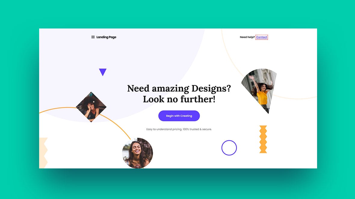
A landing page serves as your conversion engine; it should be simple, focused, and designed to elicit action. It’s the first page visitors view after clicking on your banner ad, pay-per-click (PPC) ad, or promotional email, so it must make a lasting impression. It could be a specific page on your website or a distinct page developed just for search engines.
A well-optimized landing page encourages visitors to do a certain action, such as signing up, making a purchase, or subscribing to your email list.
Finally, your landing page will most likely influence the effectiveness of your advertising campaign. A decent landing page means a good return on investment (ROI). A bad landing page wastes money.
Let’s start with the basics: the rules that every landing page should follow.
1. Never send traffic from an ad to your homepage.
You should never drive traffic from your promotional campaigns—whatever they are—to your site’s homepage. Homepages are usually cluttered with information, offering users many possible actions. The most important one might be missed.
Hence, you should drive traffic from promotional campaigns to a page that is aimed at only one thing—getting a user to take the one action that’s the goal of your campaign.
It’s the only way to convert browsers into buyers.
2. Clarity and relevance make or break your landing page.
Visitors spend just seconds looking at a landing page before determining its usefulness and relevance. If they can’t find what they’re looking for, or if your site has functional or usability problems, they will abandon the page.
Rather than let that happen, make the few seconds of their attention that you do have count. Answer the questions on their mind:
- Does this place have what I am looking for?
- Is there enough information?
- Can I trust this site?
- How long will this take?
Your landing page must entice visitors to stay and complete the desired action for conversion, whether it’s filling out a subscription form or buying a product.
3. Good landing pages follow a proven structure.
Although there is room for experimentation and variation when it comes to the anatomy of a landing page, this structure is proven to work in many good landing pages:
- Open with a benefit-oriented headline.
The headline is the most important part. If the visitors came from an ad, the headline must correspond to the ad text. If your banner or PPC ad promised a “Breakthrough meditation system,” then this phrase should also be in the headline of your landing page. - Write clear, relevant, and concise copy.
Don’t put too much text on the page; the visitor has to be able to read it quickly. Use bullet points to drive home the main points. Make sure the language in the ad is also present in the copy of the landing page. - Focus on getting visitors to take one specific action.
There should be only one possible action for the visitor to take—be it subscribing, making a purchase, whatever. Don’t offer options, or the conversions will suffer. - Remove distracting navigational links.
Remove all extra clutter—links, menus, buttons—that have nothing to do with the particular ad or campaign. Make it impossible for the visitor to ignore your message or get distracted. - Make the form or checkout option prominent.
The one action you want the visitor to take has to be big and obvious. Put a large sign-up form on the right side of the landing page; use a high-contrast color to make it stand out. If the landing page is long enough for scrolling, duplicate the form or button at the bottom of the page. - Maintain your brand.
Don’t make your landing page look different from your overall website and brand. Keep the same colors, font, and overall look and feel of your main site. This reinforces brand awareness.
5-step Process to Design the Perfect Landing Page
1. Identify your audience
Make sure the landing page talks to a specific audience. Know the problem, the need, and want of your target audience. Write the copy with a specific person in mind.
Read Also: The First 10 Steps to Launching an Online Business
If you drive traffic to the landing page via advertising and run many different ads, create many versions of your landing page. They can be mostly the same, but tweak the headline and copy.
2. Define your most-wanted action (MWA)
Your MWA is the one action people should take on the landing page.
What that action is depends on your product and strategy. Generally, if your product is somewhat expensive and complicated, it’s better to just get their email address and grow the relationship via email.
If you’re selling cheaper and/or more straightforward products (e.g. wine, socks), go directly for the sell. If your product is software, offer a free trial.
3. Define your message
You know the audience, their problem, and the solution you offer. Now craft that into an easy-to-understand message. There’s no way to know in advance what will work, so create a few hypotheses and split test them.
“Clarity trumps persuasion” is a good maxim.
4. Design your landing page
Your MWA is in place, you understand your target audience, and you have a hypothesis about which offer will appeal to them. How do you design a landing page to motivate them to take action?
First, list all the elements you need on your landing page.
What your landing page needs to have:
- Headline that speaks to the target audience;
- Company logo;
- Quick explanation of your offer above the fold (i.e. visible without the average user having to scroll down);
- Longer explanation of the offer below the fold if the offer or product is complex;
- Image of the product being offered;
- Simple form, ideally with just 1–3 fields (usually just name and email, but do you really need the name?);
- Buy or sign-up button depending on your MWA;
- Link to your privacy policy (load it in a pop-up window to keep people on the page).
Remember, the more fields you ask the visitor to fill in, the more friction you create; therefore, fewer people will fill out the form.
What you should leave out:
- Navigation menu—focus only on your offer;
- Links to other parts of your site, such as “About Us”;
- Pictures or images that don’t relate to the offer; these are distractions;
- Hard-to-read text (i.e. anything less than 12px);
- Scary forms with unnecessary fields, such as “title” or “fax”;
- “Clear fields” button;
- Links like “Click here to subscribe” or “Click here to read more.” If you can’t cram all your content above the fold, let the user scroll down. Scrolling is almost always better than clicking to another page.
There are always exceptions, and you (usually) can’t copy best practices directly to your site, but this advice should be your starting point. Get the essentials in place first and tweak from there.
5. Put it all together
Once you’ve created your page layout and the copy, put it together and upload it to your site. Use simple URLs that users can easily recognize. If your landing page is about job offers to work on an oil rig, your URL should be something like somesite.com/oil-rig-job-offers/.
Such URLs often generate better click-through rates on Google Ads. A searcher who types “oil rig job offers” is more likely to click on an ad with a keyword-rich URL.
6. Test, test, test
Once everything is up and running, test the effectiveness of the landing page based on your predetermined MWA. You should always create at least two alternate versions of a landing page. Test them, measure, and improve.









Comments