
 By
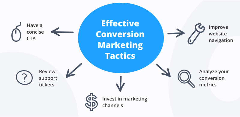
Conversion optimization is no longer simply about adding a brighter button or shortening a headline. Modern websites need to understand who is visiting, why they arrived, what they expect to see, and where they are in the buying journey.
That is where advanced cloaking and placement tactics can become useful—provided “cloaking” means legitimate context-aware content presentation, not deceptive search-engine manipulation.
The distinction is important. Google defines cloaking as presenting different content to users and search engines with the intention of manipulating rankings and misleading users. It remains prohibited under Google’s current spam policies.
For conversion rate optimization (CRO), the safer and more effective approach is to personalize experiences based on legitimate signals such as campaign, device, geography, customer status, product interest, or funnel stage while keeping the underlying value proposition truthful and accessible.
The opportunity is significant. Unbounce’s latest benchmark analyzed more than 41,000 landing pages, 464 million visitors, and 57 million conversions, finding a median landing-page conversion rate of 6.6% across industries.
Meanwhile, Baymard’s current research puts average ecommerce cart abandonment at approximately 70.22%, demonstrating how much conversion potential remains after a visitor has already expressed purchase intent.
What Are Cloaking and Placement Tactics in CRO?
In a CRO context, advanced “cloaking” should be understood as selectively presenting relevant content or interface elements to different audience segments, rather than hiding content from search engines.
For example, an ecommerce company could display:
- A first-time visitor offer to new visitors.
- A loyalty incentive to returning customers.
- A product-specific CTA to visitors arriving from a product campaign.
- A mobile-optimized checkout interface to smartphone users.
- Different explanatory copy for beginners versus experienced buyers.
The objective is not to deceive. It is to reduce friction between visitor intent and the next logical action. Placement tactics determine where those conversion elements appear. The combination is powerful:
Audience/context → relevant message → strategic placement → lower friction → conversion
Recent Conversion Statistics You Should Know
Data should guide CRO decisions rather than assumptions. The following figures provide useful benchmarks.
| CRO Metric | Recent statistic | Why it matters |
|---|---|---|
| Median landing-page conversion rate | 6.6% | Useful broad benchmark |
| Landing pages analyzed | 41,000+ | Large benchmark sample |
| Landing-page visitors analyzed | 464M+ | Significant traffic volume |
| Landing-page conversions analyzed | 57M+ | Strong conversion dataset |
| Average cart abandonment | 70.22% | Major ecommerce opportunity |
| Shoppers abandoning because of high extra costs | 40% | Pricing transparency matters |
| Abandonment due to slow delivery | 20% | Shipping expectations influence conversion |
| Abandonment from lack of trust | 19% | Trust signals are critical |
| Abandonment because account creation was required | 18% | Guest checkout can reduce friction |
| Abandonment from complicated checkout | 17% | Simplification has measurable value |
These figures come primarily from recent Unbounce and Baymard research.
The lesson is straightforward: conversion optimization is often about removing uncertainty and friction rather than creating more persuasion.
1. Segment Visitors Before Changing the Experience
The first advanced tactic is segmentation. Instead of designing one generic landing page for everyone, identify meaningful differences in visitor intent.
Useful segmentation variables include:
- Traffic source — organic search, paid search, social, email, referral, affiliate.
- Campaign — the specific advertisement or promotion that generated the visit.
- Device — desktop, tablet, or mobile.
- Customer status — new, returning, subscriber, or existing customer.
- Funnel stage — awareness, consideration, evaluation, or purchase.
- Product interest — categories, products, or content previously viewed.
- Geographic context — country, region, shipping availability, or language.
- Behavioral intent — engagement, scroll depth, repeat visits, or abandoned-cart status.
However, avoid creating dozens of micro-segments without enough traffic to measure them. Segmentation should create a meaningful experience difference that can be tested.
2. Match Landing-Page Messaging to Visitor Intent
One of the highest-impact placement principles is message continuity. Suppose an advertisement promises:
“Cloud Accounting Software for Small Businesses”
The landing page should immediately reinforce that promise. Don’t force visitors to search through generic corporate messaging before discovering the product advertised.
A strong landing-page hierarchy typically looks like this:
Traffic promise → headline → supporting benefit → proof → CTA
This creates what marketers often call message match.
For example:
| Visitor intent | Recommended headline emphasis | Primary CTA |
|---|---|---|
| Researching solutions | Education and benefits | Learn More |
| Comparing products | Differentiators and proof | Compare Options |
| High purchase intent | Value, price, availability | Buy Now |
| Returning customer | Familiarity and convenience | Continue |
| Free-trial visitor | Product value and low risk | Start Free Trial |
The objective is to make the next action obvious.
3. Use Above-the-Fold Placement Strategically
Above-the-fold real estate is valuable, but that does not mean every page should contain five CTAs. The visitor should understand three things quickly:
- What the offer is.
- Why it matters.
- What they should do next.
A high-performing hero section might contain:
Headline
Clear outcome or value proposition.
Supporting copy
One or two sentences addressing the main objection.
Primary CTA
A visually prominent action.
Risk reducer
For example, “No credit card required” or “30-day returns.”
Trust signal
Customer count, review rating, recognizable client logos, or relevant certification.
The critical principle is hierarchy. The primary CTA should visually dominate secondary actions.
4. Place CTAs According to Buying Intent
CTA placement should reflect the user’s readiness rather than follow an arbitrary design rule. For short landing pages, a CTA near the top may be sufficient. Long-form sales pages require additional opportunities to convert.
Read Also: Enhance the Conversion Rate of Your TikTok Ads With the Most Effective Method
Consider placing CTAs:
- After the primary value proposition.
- After a major benefit section.
- After customer testimonials.
- After pricing information.
- After an objection-handling section.
- At the end of the page.
However, repetition should remain purposeful. Every CTA should represent the same logical conversion goal unless the visitor has reached a different stage of the funnel.
Primary vs. Secondary CTAs
Use one dominant action.
For example:
Primary: Start Free Trial
Secondary: Watch Demo
Avoid giving equal visual weight to:
- Start Trial
- Download Guide
- Contact Sales
- View Pricing
- Book Demo
- Subscribe
When everything is emphasized, nothing is emphasized.
5. Personalize Placement Without Deception
Ethical personalization can improve relevance without manipulating search engines.
For example, a SaaS website might show a “Book a Demo” CTA prominently to visitors from an enterprise campaign, while presenting “Start Free Trial” to visitors coming from a self-service campaign.
The underlying product remains the same. The interface simply prioritizes the most relevant next step. This is fundamentally different from SEO cloaking.
Google explicitly warns against showing one version of a page to Googlebot and another to human visitors for ranking manipulation.
A useful rule is:
Personalize the experience, not the truth.
Don’t hide material information, prices, limitations, or important product details simply because a particular visitor segment is less likely to convert after seeing them.
6. Optimize Checkout Placement
For ecommerce businesses, checkout optimization can produce some of the largest gains. Baymard’s current research reports a 70.22% average cart abandonment rate across 50 studies.
More importantly, many abandonment causes are addressable.
Baymard reports that:
- 40% cite excessive additional costs.
- 20% cite slow delivery.
- 19% cite lack of trust.
- 18% don’t want to create an account.
- 17% consider checkout too complicated.
- 12% cannot see or calculate the total cost upfront.
That makes placement extremely important.
Place critical information where users make decisions:
| Information | Recommended placement |
|---|---|
| Total price | Cart and checkout summary |
| Shipping cost | Before payment |
| Delivery estimate | Near shipping selection |
| Returns policy | Near purchase reassurance |
| Security information | Near payment section |
| Guest checkout | Prominent account-selection area |
| Promo code | Accessible but not visually dominant |
| Primary payment CTA | Immediately after required information |
Baymard’s 2025 checkout benchmark found that 62% of sites fail to make guest checkout the most prominent account-selection option.
7. Use Trust Signals Where Anxiety Happens
Trust badges placed randomly in a footer have limited value. Instead, position reassurance close to the point of uncertainty.
For example:
Payment stage:
Secure payment messaging.
Price stage:
Transparent total-cost explanation.
Delivery stage:
Delivery date and shipping information.
Purchase stage:
Returns guarantee or refund policy.
Lead-generation stage:
Privacy reassurance and explanation of what happens after submission.
The closer the trust signal is to the objection, the more useful it becomes.
8. Optimize Mobile Placement Separately
Do not simply shrink a desktop page for mobile. Mobile users have different interaction constraints, so CTA placement, navigation, forms, and content hierarchy should be evaluated independently.
Important mobile CRO considerations include:
- Keep the primary CTA accessible without excessive scrolling.
- Use large enough touch targets.
- Avoid intrusive pop-ups.
- Reduce unnecessary form fields.
- Make pricing and shipping information easy to locate.
- Use sticky CTAs only when they genuinely improve access.
- Test checkout flows on real mobile devices.
Baymard’s 2025 benchmark found that 63% of mobile e-commerce sites had mediocre or worse checkout UX, compared with 64% of desktop sites. That suggests mobile checkout remains a major optimization opportunity.
9. Use Behavioral Triggers Carefully
Advanced CRO systems can use behavioral signals to determine when an element should appear.
Potential triggers include:
- Exit intent.
- Scroll depth.
- Time on page.
- Repeat visits.
- Cart activity.
- Product views.
- Search behavior.
- Previous purchases.
For example, an exit-intent message could remind a visitor about free shipping rather than immediately offering a discount. This is important because excessive incentives can train customers to wait for promotions.
A better hierarchy is:
Remove uncertainty → increase relevance → reduce friction → add incentive only when necessary.
10. Test Placement Instead of Assuming It Works
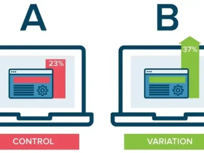
The most sophisticated placement strategy is still only a hypothesis until measured. Use controlled A/B testing where possible.
For each experiment, define:
- Hypothesis: Moving the CTA below the pricing explanation will increase completed purchases because users need price context before committing. Primary metric: Completed purchase rate.
- Secondary metrics: CTA clicks, checkout starts, revenue per visitor, refund rate.
- Guardrails: Bounce rate, customer complaints, page speed, and downstream revenue quality.
Don’t declare victory because a CTA receives more clicks. More clicks can be meaningless if fewer users complete the final conversion.
11. Build a Placement Testing Matrix
A systematic testing framework prevents random experimentation.
| Element | Test A | Test B | Success metric |
|---|---|---|---|
| Hero CTA | Start Trial | See Demo | Qualified conversions |
| CTA position | Above benefits | Below benefits | Conversion rate |
| Form | 8 fields | 4 fields | Completed leads |
| Trust proof | Logos | Customer statistics | Conversion rate |
| Pricing | Early | After benefits | Revenue per visitor |
| Checkout | One page | Multi-step | Purchase completion |
| Sticky CTA | Off | On | Mobile conversion |
Prioritize experiments using three factors:
Potential impact × confidence × ease of implementation This prevents teams from spending weeks testing tiny cosmetic changes while ignoring major checkout problems.
12. Common Mistakes to Avoid
Advanced CRO can become counterproductive when personalization becomes excessive.
Avoid:
- Showing materially misleading content to different audiences.
- Creating hidden SEO-only content.
- Using deceptive redirects.
- Making important information disappear behind unnecessary interactions.
- Adding pop-ups before users understand the offer.
- Over-personalizing with insufficient data.
- Changing multiple variables simultaneously without a valid experimental design.
- Optimizing clicks instead of revenue or qualified conversions.
- Copying competitor layouts without understanding user intent.
Google’s current documentation states that policy violations can result in lower rankings or complete exclusion from Search. Therefore, sustainable CRO should always prioritize user value, transparency, accessibility, and measurable business outcomes.
Final Thoughts
Advanced cloaking and placement tactics for conversion should not be about hiding information or manipulating search engines. The sustainable approach is intelligent personalization combined with deliberate interface placement.
The strongest CRO strategies use visitor intent to determine what information deserves priority, then position that information where the user needs it most.
Recent benchmarks show why this matters. Landing pages have a 6.6% median conversion rate across Unbounce’s large dataset, while e-commerce cart abandonment remains around 70%. Those numbers reveal enormous room for improvement.
The practical formula is simple:
Understand intent → match the message → place the CTA strategically → remove friction → reinforce trust → test the result.
When implemented transparently, these tactics can create a more relevant experience for visitors while improving conversion rates, revenue per visitor, and long-term customer value.
The goal isn’t to make users convert through manipulation. The goal is to make the right conversion easier for the right visitor at the right moment.
FAQ
What is advanced cloaking in CRO?
Advanced cloaking in CRO refers to ethically personalizing content and page elements based on visitor context, such as traffic source, device, behavior, or funnel stage. It should never involve deceptive content intended to manipulate search rankings.
Where should CTAs be placed for better conversions?
Place primary CTAs where users are most likely to make decisions, including near the value proposition, after key benefits, pricing information, testimonials, and at the end of long-form pages.
How does personalization improve conversion rates?
Personalization makes content and offers more relevant to individual visitors. Matching messaging, CTAs, and recommendations to user intent can reduce friction and make the next action clearer.
Is cloaking allowed for SEO?
Deceptive cloaking that shows different content to search engines and users for ranking manipulation violates Google’s spam policies. Ethical personalization should maintain truthful, useful content for both users and search engines.
Source: hostinger.com









Comments