
 By
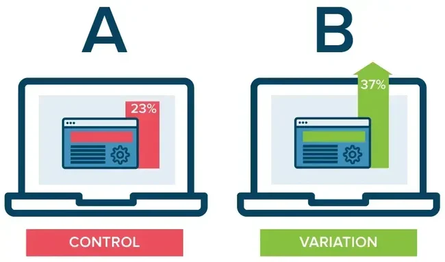
What if moving an affiliate link a few inches higher on a webpage could dramatically change how many people click it? Or what if placing the same link immediately after a product comparison generated more clicks than burying it near the bottom of an article?
These are the kinds of questions that make A/B testing so valuable.
For affiliate marketers, bloggers, ecommerce businesses, and digital publishers, small design changes can sometimes produce surprisingly large differences in click-through rate (CTR). Link placement, surrounding text, visibility on mobile screens, and the moment a reader encounters a recommendation can all influence whether they click.
A 50% increase in CTR sounds impressive, but it needs context. Moving a link does not automatically produce a 50% lift. That result depends on the starting CTR, the audience, the content, and the change being tested. It should be treated as a possible experimental outcome, not a universal benchmark.
Google describes A/B testing as showing different versions of a webpage to randomized groups of users to determine which performs better against a chosen goal. Its examples include testing changes intended to increase click-through rates.
In this guide, we’ll explore how link placement affects user behavior, how to run reliable A/B tests, what usability research tells us about webpage attention, and how businesses in the United States and other developed markets can use small changes to improve their results.
What Is A/B Testing, and Why Does Link Placement Matter?
A/B testing is a method of comparing two versions of a webpage, email, or other digital experience to see which produces a better result.
- Version A: Your original link placement.
- Version B: The same link moved to a different location.
- Primary metric: The percentage of eligible visitors who click the link.
For example, imagine you run an affiliate website that publishes a guide to the best wireless headphones. Your current affiliate link appears at the end of a 1,500-word review. You decide to test a second version where the link also appears directly below the product’s key advantages.
If the second version receives more clicks from a comparable group of visitors, you have evidence that the placement may be more effective. The reason this can work is simple: people do not read every webpage from beginning to end. They scan, look for useful information, and decide whether an action is worth taking.
Nielsen Norman Group’s eye-tracking research found that users often scan webpages in an F-shaped pattern, paying particular attention to upper content areas before moving down the page. The pattern varies with the page and task, but it helps explain why content hierarchy and placement matter.
A link can be relevant and well-written yet receive few clicks if readers never notice it.
Understanding the 50% CTR Increase
Before moving links around your website, it is important to understand what a 50% increase actually means.
CTR is calculated using this formula:

For a webpage, you might define impressions as page views or unique eligible visitors who had an opportunity to see the link. The important thing is to choose a consistent denominator and use it for both versions.
Consider this example:
What a 50% relative lift looks like
Original link
4%
40 clicks per 1,000 eligible visitors
New placement
6%
60 clicks per 1,000 eligible visitors
Notice the distinction between relative and absolute improvement. Going from 4% to 6% means CTR increased by 2 percentage points, but by 50% relative to its original value.
This distinction matters when reporting test results to clients, management teams, or affiliate partners. A change from 10% to 15% is also a 50% relative lift, but it produces five additional clicks per 100 eligible visitors rather than two.
The Latest Evidence: What Research Says About Click Behavior
There is no universal, independently verified statistic showing that moving a link to a particular position will increase CTR by 50% across websites. Results vary considerably by context.
However, established usability research offers several useful insights.
|
Research or guidance |
Key finding |
Practical implication |
|---|---|---|
|
Nielsen Norman Group, eye-tracking research |
Readers often scan pages in an F-shaped pattern. |
Important links should appear near relevant content and within a clear visual hierarchy. |
|
Nielsen Norman Group, clickable elements research |
Clear visual cues help users recognize clickable elements. |
Links should look clickable and have descriptive labels. |
|
Google Analytics documentation |
A/B experiments can compare variants against click-through and other engagement metrics. |
Measure link placement with a controlled experiment. |
|
Google Search Central |
Website experiments should run only as long as necessary to obtain reliable results. |
Avoid leaving experiments running indefinitely. |
These sources support the importance of visibility, clarity, and testing. They do not establish that any particular link position guarantees a specific percentage increase.
Why small changes can have a large effect
Imagine that most visitors to your review article read the opening summary and then jump straight to the product comparison table. If your affiliate link appears only after a lengthy explanation of the product’s technical specifications, many visitors may never reach it.
Moving a relevant link closer to the comparison table could make it easier to find. Even if the design change is small, it may affect a large number of visitors. The effect will be smaller if the original link was already prominent or if most readers prefer to finish the article before clicking.
Five Link Placement Tests Worth Trying

1. Above the fold versus below the introduction
The area visible before scrolling is commonly called above the fold. It can be a useful place to test a primary link, especially when readers arrive with strong purchase intent.
For an affiliate review, Version A might place the link after the introduction, while Version B places it beneath a short product summary.
The second version might perform better if the summary gives readers enough information to make an informed decision. Alternatively, the link may perform worse if visitors need more context before trusting the recommendation.
Best for: Product reviews, landing pages, and high-intent comparison articles.
2. Within the article versus at the end
Some readers are ready to click after reading a product’s main advantages. Others want to see the full analysis first.
Test an inline link after the key findings against a link at the end of the article. You can also keep the end-of-article link in both versions and test whether adding an inline link produces incremental clicks.
Best for: Long-form content, software reviews, tutorials, and buying guides.
3. Beside a product image versus inside the text
A product image can draw attention, but readers should not have to guess whether it is clickable. You could test a clearly labeled link beneath the image against a contextual text link beside the product’s main benefits.
Read Also: Statistically Speaking: Which Niches Have the Highest Affiliate Payouts This Year?
Nielsen Norman Group advises making clickable elements recognizable and using clear visual cues to reduce uncertainty.
Best for: E-commerce product pages, affiliate roundups, and comparison pages.
4. Inside a comparison table versus outside it
Readers comparing several products often look at tables for price, specifications, and key differences.
Test a link in the table’s product row against a link immediately below the table. Make sure the wording communicates what happens after the click, such as checking a price or viewing product details.
Best for: “Best of” articles, software comparisons, and product roundups.
5. Desktop placement versus mobile placement
A link that is easy to notice on a desktop screen might be pushed far down a mobile page by images, banners, or large blocks of text. Test mobile and desktop performance separately. Check that the link is readable, accessible, and easy to tap without accidentally triggering neighboring links.
Best for: Websites that receive meaningful traffic from both mobile and desktop users.
Remember that these are hypotheses to test, not guaranteed winners. The best placement depends on what the visitor is trying to accomplish.
How to Run an A/B Test Step by Step
A useful experiment starts with a clear question rather than a random design change.
-
Choose one primary objective.
Decide whether you want to increase affiliate CTR, newsletter sign-ups, downloads, or another measurable action. For this article, use affiliate CTR.
-
Record your baseline.
Measure the current CTR before making changes. Record traffic sources, device types, and the period covered.
-
Create a single meaningful variation.
Move the link while keeping its text, destination, and surrounding content consistent. This makes it easier to attribute a difference to placement.
-
Split traffic randomly.
Show Version A and Version B to comparable groups at the same time. Avoid sending all mobile users to one version and desktop users to the other.
-
Track clicks accurately.
Use your analytics platform or testing tool to record the assigned version, eligible visitors, and successful link clicks. Exclude bots and internal testing traffic where practical.
-
Wait for sufficient evidence.
Determine the required sample size in advance. Consider the expected effect, baseline CTR, and acceptable false-positive risk.
-
Review the result and implement carefully.
Compare CTR alongside downstream conversion and revenue. If the evidence is inconclusive, keep testing or retain the original version rather than declaring a winner.
Google’s A/B testing documentation explains that randomized variants can be used to assess which version performs better against a defined goal. In a typical website setup, a separate experimentation tool manages the test, while Google Analytics helps interpret the resulting data.

Examples from the United States and Other Developed Countries
The same testing principles apply across markets, but the best link position can differ according to the audience, device, and purpose of the page.
United States: Affiliate product reviews
Consider a U.S. website that reviews home office equipment. The publisher notices that visitors read the product summary but rarely click through to the retailer.
The team tests two layouts:
- Version A places the affiliate link after a detailed product description.
- Version B places it immediately after a short summary of the product’s main benefits.
The team compares CTR, retailer purchases, and commission revenue. If Version B increases clicks without reducing purchase quality, it may be a better layout.
This is a hypothetical example, not a reported case study or a claim of a measured 50% lift.
United Kingdom: Financial and software comparison pages
A UK publisher comparing budgeting applications might place its primary link at the end of a lengthy feature list. A test could compare that layout with a link beside a concise summary of pricing, supported devices, and key features.
Because financial and software decisions often require careful consideration, the publisher should also monitor whether the new placement leads to meaningful sign-ups rather than simply more clicks.
Germany: Technical product comparisons
A German technology website might compare laptops, monitors, or energy-efficient appliances. Readers may want to evaluate specifications before visiting a retailer.
Testing a link within the comparison table against one below the table can show which position helps users take the next step. The publisher should ensure that both layouts remain accessible and that the comparison remains clear.
Australia: Mobile-first shopping content
An Australian publisher reviewing outdoor gear might find that mobile visitors have to scroll past several large product images before reaching a retailer link. A mobile-specific test could place the link immediately after the product’s main pros and cons, while keeping the desktop layout unchanged.
The team should measure mobile CTR separately and check that visitors still understand the recommendation before clicking. These examples show how to form useful hypotheses. They do not imply that one country, product category, or placement will consistently deliver the same result.
Common A/B Testing Mistakes to Avoid
Even a promising result can be misleading if the test is poorly designed.
-
Changing too many things at once: If you change link position, color, wording, and page structure together, you will not know which change made the difference.
-
Stopping as soon as results look positive: Early results can fluctuate. Set a testing period or sample-size requirement in advance.
-
Ignoring device differences: Desktop and mobile users may interact with the same page differently.
-
Optimizing for clicks alone: More clicks are not always better if they produce fewer sales, lower-quality leads, or more immediate exits.
-
Testing during unusual traffic periods: A major promotion or seasonal event can affect visitor behavior and distort comparisons.
-
Forgetting accessibility: Links should have meaningful labels, sufficient contrast, and a usable focus state for keyboard navigation.
Google Search Central also advises against showing search engines a different version of a test page from the version presented to users. Its guidance recommends avoiding unnecessary testing duration and removing experiment elements when testing ends.
Bottomline
A/B testing your links is one of the simplest ways to learn how visitors interact with your website. Moving a link closer to a product summary, placing it inside a comparison table, or making it easier to find on mobile can sometimes produce meaningful improvements in CTR.
But the real value lies in testing rather than guessing. A 50% increase is possible under the right conditions, yet it is not a result every website should expect. Your baseline performance, audience intent, content quality, and the size of the change all matter.
Start with one link and one clear hypothesis. Split traffic fairly, track clicks accurately, and measure what happens after the click. If a new placement increases both engagement and meaningful conversions, you have a change worth keeping.
The goal is not to make every link more prominent. It is to help people find the right link at the moment it becomes useful to them.
FAQ
1. Can moving a link increase CTR by 50%?
Yes, it is possible, but it is not guaranteed. A link moved from an overlooked position to a relevant, highly visible location may attract substantially more clicks. For example, a rise from 4% CTR to 6% represents a 50% relative increase. You need a controlled experiment to determine whether the change genuinely improves your website’s performance.
2. Where is the best place to put a link on a webpage?
The best position depends on the visitor’s intent and the page’s structure. Useful locations to test include below an introduction, beside a product summary, inside a comparison table, and at the end of an article. Links should appear where readers need them, with clear wording that explains what they can expect after clicking.
3. How long should an A/B test run?
An A/B test should run until it has collected enough data to evaluate the expected difference reliably. The required duration depends on traffic volume, baseline CTR, the size of the improvement you want to detect, and normal fluctuations in visitor behavior. Avoid stopping early just because one version temporarily appears to be winning.
4. Which metrics should I track when testing link placement?
Track CTR as your primary metric if the goal is to increase clicks. Also measure downstream conversion rate, revenue per visitor, and earnings per click if you use affiliate links. These additional metrics help you determine whether the new placement generates valuable engagement rather than simply encouraging more people to click.
Sources: Nielsen Norman Group’s scanning research , clickable elements guidance , Google Analytics A/B testing documentation , and Google Search Central’s website testing guidance .











Comments