
 By
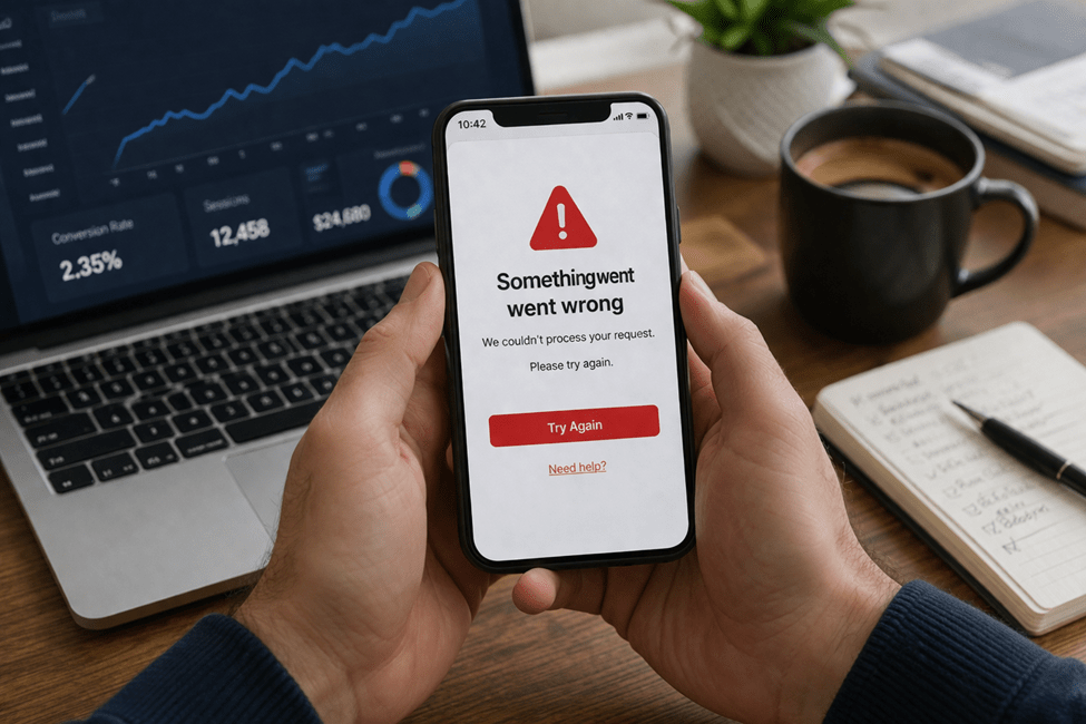
Most teams do not think of error messages as conversion problems.
They think of them as small UX details. Minor copy. Something to clean up later.
That is usually the wrong read.
An error message often shows up at the exact moment a user is most fragile. They are trying to sign up, make a payment, submit a form, reset a password, book something, or finish a task that already took effort. If the app fails and then responds with a vague, cold, or unhelpful message, the product does more than create confusion. It breaks momentum.
And that is where conversion starts leaking.
Most users will not stop and think, “This app has weak error-state design.” They will think something simpler.
“This app is annoying.”
Then they leave.
That is why error messages matter more than people think. They are not side details. They are often the moment the app either helps the user recover or quietly pushes them out.
Most users do not read errors. They react to them
This is the first thing teams need to understand.
When something fails, most users are not carefully reading every word on the screen. They are scanning fast and trying to answer three questions:
- What happened?
- Can I fix it?
- Is this app still worth my time?
If the message is vague, stiff, or overly technical, the user usually does not slow down and try harder. They get frustrated faster.
That is why the emotional effect of the message matters almost as much as the message itself.
A payment error during checkout does not feel like a neutral event. A failed login does not feel neutral either. These moments already come with tension. The user is trying to complete something. If the app responds with language that feels robotic or dismissive, trust drops immediately.
A lot of products lose people right there.
The most common ways apps get error messages wrong
Most bad error handling is not complicated. It is just lazy.
Vague language
This is the classic one.
Messages like:
- Something went wrong
- Error occurred
- Invalid input
- Request failed
These are technically messages. They are not useful messages.
They do not tell the user what actually happened, what needs to change, or what to do next.
Blaming the user without context
Some apps make the message feel like the user did something wrong, even when the problem is unclear.
Examples:
- Incorrect information
- Invalid request
- You entered the wrong details
That kind of wording creates friction fast, especially when the user is not even sure what part of the input caused the problem.
Dead-end screens
This is where the message appears, but there is no real recovery path.
The app tells the user something failed, then gives them nothing helpful:
- no retry button
- no resend option
- no save progress
- no visible support path
That is not just bad UX. It is wasted acquisition effort.
Too much technical language
Users do not want internal system language.
They do not need to see:
- authentication token expired
- validation error on payload
- network timeout in request pipeline
Even if that language is accurate, it is not useful in the moment.
The message should speak to the user, not to the engineering team.
Why weak error handling hurts conversion more than teams think
A lot of teams underestimate the business cost here because error messages feel small.
But they usually show up in high-stakes moments:
- checkout
- sign-up
- booking
- password reset
- document upload
- account verification
Those are not random screens. They are the screens tied directly to revenue, activation, or retention.
If an app gives a weak error during checkout, the user may abandon the cart.
If an app gives a vague verification error during sign-up, the user may never create the account.
If an upload fails and the app gives no path forward, the user may not trust the product enough to try again.
That is the real issue.
Users often read one bad error as a signal about the whole product. They do not separate “this screen failed” from “this app feels unreliable.” It all blends together.
That is why one weak error message can do more damage than teams expect. It turns a fixable failure into a trust problem.
Good error messages do three things fast
A useful error message usually does not need to be long. It just needs to do the right work.
1) Say what happened
Not in technical language. In plain language.
Bad:
- Payment failed
Better:
- Your payment did not go through.
Even that small shift feels more human.
2) Say what the user can do next
This is the part many apps skip.
Bad:
- Verification failed
Better:
- That code expired. Request a new one and try again.
A message without a next step increases frustration because it leaves the user stuck in the same place emotionally and practically.
3) Keep the tone calm
This matters more than people think.
The app should sound like it is helping, not judging.
Bad:
- Invalid phone number
Better:
- Please enter a valid phone number, including the country code.
The second version is clearer, calmer, and easier to act on.
That is the tone strong products use. Not dramatic. Not cold. Just useful.
Recovery paths matter as much as the message itself
The copy can be perfect and the experience can still fail if the recovery path is weak.
This is where a lot of apps fall short.
Examples:
OTP resend flows
If the code does not arrive, users need a clean next step.
That means:
- resend option is obvious
- countdown is clear
- app does not break if they switch screens
- there is another path if the code never comes
Password reset
If the user hits a login problem, the reset flow should not feel like a punishment.
The faster the product gets them back into the app, the better the chance of saving the session.
Payment retry
If a card is declined, the message should tell the user what they can try next:
- use another card
- check billing details
- try again in a moment
A dead-end payment screen is one of the fastest ways to lose a customer who was already halfway through converting.
Upload or form failure
If a long form or document upload fails, users should not have to start from zero.
Save progress when possible. Make retry easy. Respect the effort the user already gave you.
That alone changes how expensive the failure feels.
What better product teams do differently
The better teams do not treat error messages like filler copy.
They treat them like part of the product.
That means they:
- write them intentionally
- test them in real scenarios
- make sure recovery is built in
- think about user emotion, not just technical accuracy
This is where working with a professional mobile app development company can make a real difference, because good teams do not leave error states until the end and patch them in as an afterthought. They treat them as part of the conversion flow from the start.
That mindset changes the product.
Instead of asking, “What should the error say?” they ask better questions:
- Why is the user hitting this problem?
- What do they need next?
- How do we reduce the chance they leave right here?
That is a much stronger product conversation.
What to measure if you want to fix this
If you want to improve error handling, broad engagement metrics are not enough.
You need to look at the places where users fail and what happens after.
A few useful metrics:
- drop-off after an error state
- retry success rate
- checkout recovery rate
- form completion after validation error
- support tickets tied to common failures
These numbers help you find what is quietly damaging conversion.
For example, if users hit a card error but very few recover and complete checkout, the message and recovery path may be the issue.
If users start sign-up but never finish verification, the problem may not be demand. It may be a weak error flow around codes or validation.
The point is simple.
If you do not measure what happens after failure, you are missing a big part of the product story.
Why the best error messages barely feel like errors
The strongest error handling usually feels invisible.
The user runs into a problem, gets a clear explanation, sees the next step, and keeps going.
That is the real goal.
Not creating perfect copy for its own sake.
Keeping momentum alive.
When apps do this well, users do not think, “That was a great error message.” They just recover and move on.
That is exactly what you want.
Because in most products, failure is going to happen sometimes.
The real question is whether the app turns that failure into a dead end or a recoverable moment.
And in a lot of cases, that is the difference between a lost conversion and a saved one.
Dejan Kvrgic
Dejan Kvrgic is the Senior Marketing Manager at AppMakers USA and serves as CMO, responsible for growth strategy and acquisition planning. With 10 plus years in digital marketing, he focuses on positioning, channel execution, and performance measurement that ties back to real customer demand. Outside of work, he spends time on sports, outdoor activities, gaming, and flying drones.











Comments