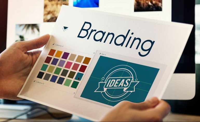
An excellent logo is distinctive, readily recognizable, and strongly associated with the key concepts and values of your company. Consider famous logos such as those of Nike, Coca-Cola, and Apple. These kinds of logos are understated and sophisticated, yet they’re also aggressive enough to make an impact.
When creating your logo, you have a significant influence on how people view your company. Creating a classic logo can be difficult, but we can assist. You must have a solid understanding of your market, buyer personalities, and company culture in order to create an effective logo.
In order to comprehend what a logo is, we must first comprehend its primary function. The goal of the design process should be to create a logo that is instantly recognizable and evokes feelings of loyalty, respect, and suggested superiority. One component of a business’s commercial brand or economic entity is its logo, which typically stands out from other logos in the same market niche due to its unique forms, colors, typefaces, and imagery. Logos is a means of recognition.
Paul Rand, one of the world’s greatest designers states that “a logo is a flag, a signature, an escutcheon, a street sign. A logo does not sell (directly), it identifies. A logo is rarely a description of a business. A logo derives meaning from the quality of the thing it symbolizes, not the other way around. A logo is less important than the product it signifies; what it represents is more important than what it looks like. The subject matter of a logo can be almost anything.”
Types of Logos
You might be astonished to learn that all of the millions of logos in the world fall into one of seven primary groups. While creating your logo, consider the qualities, advantages, and disadvantages of each logo type to choose which one best fits your brand’s objectives and core values.
1. Emblems

An emblem is a traditional type of logo that consists of text integrated within a symbol or icon to create a unified image. Emblems have an official, formal look that gives off an air of cohesion and strength. They work well for brands like Harvard that wish to communicate their rich history and traditional values.
Pros
- Forms a unified image that can be strong and impactful
- Typically perceived as formal or classic
Cons
- The combination of symbol and text can be difficult to separate for integration into other design assets
- Complex emblems may not reproduce well at small sizes
2. Pictorial Marks (or Logo Symbols)
Pictorial marks, or logo symbols, are icon or graphic-based logos. A logo symbol omits text and relies on a single image to represent the brand. These types of logos can be iconic and memorable.
Other examples include Target’s bullseye and Starbucks’ siren.
Pros
- It can be understood across all languages and cultures
- Simple and effective
Cons
- Brand recognition can be more challenging to establish without any text
- Logo symbols must be chosen wisely and may or may not connect to the brand’s purpose
3. Wordmarks (or Logotypes)

Wordmarks are text-based logos that use font selection, typography, and color to turn the brand name into a logo. Wordmarks often work well with companies with unique, catchy names, such as Google, Coca-Cola, and Disney.
Pros
- Simplicity
- Easy to incorporate into other design assets
Cons
- It can be challenging to create a unique, memorable logo with only text
- Not suited for longer or less unique company names
4. Monogram Logos (or Lettermarks)
Monogram logos, also known as lettermarks, are another typography-based logo. Unlike wordmarks that use the entire brand name, monograms typically use initials to create a streamlined logo for companies with longer names.
Read Also: Branding Ideas for Small Businesses
Other examples include HBO (Home Box Office) and IBM (International Business Machines).
Pros
- Concise and easy to remember
- Easily scalable
Cons
- You may need to place the full brand name below it until recognition is achieved
- It can be confusing if initials match another brand
5. Abstract Logo Marks

Abstract logos are unique pictorial representations of a brand. What is the Pepsi logo, anyway?
Unlike Apple and Target, whose logos represent real-life things (an apple and a bullseye), Pepsi’s logo is an abstract representation of the brand that doesn’t rely on any specific, real-life image.
Instead, it uses a combination of geometric forms and colors to cultivate the meaning and emotion of the brand.
Pros
- Inherently unique and challenging to mimic
- Can communicate complex ideas with simple shapes and colors
Cons
- Their abstract nature leaves them open to interpretation (and misinterpretation)
- Logo meaning may be unclear, especially for unestablished brands
6. Mascot Logos
Mascot logos typically involve an illustrated character to create a fun, cartoonish, and friendly personification of a brand. Brands that choose to go with a mascot logo usually seek a light-hearted and family-friendly image.
Other examples of brand mascots include the Kool-Aid Man, Mr. Peanut, and the Pillsbury Doughboy.
Pros
- Mascots are inviting and approachable, which helps cultivate a family-friendly brand image
- Allows for a high level of control over brand storytelling
Cons
- Not suitable for brands with a serious or corporate image
- It can be complex from a design perspective, making reproduction at smaller sizes a challenge
7. Combination Marks

A combination mark is a logo that combines text and an icon. It can be either a wordmark or a lettermark combined with an abstract mark, a pictorial mark, or a mascot.
A combination mark is a versatile choice that allows you to present your brand name for easy recognition while also taking advantage of a memorable icon or image.
Pros
- Allows for many variations of your logo, such as text-only and image-only
- The combination of image and text makes the brand message very clear
Cons
- It can be complex and may not scale down well
- It can appear overly busy if not thoughtfully designed
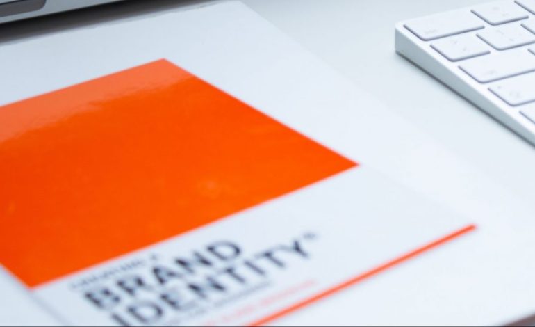
A good logo is distinctive, appropriate, practical, graphic, and simple in form, and it conveys the owner’s intended message. A concept or “meaning” is usually behind an effective logo, and it communicates the intended message. A logo should be able to be printed at any size and, in most cases, be effective without color. A great logo essentially boils down to two things: great concept and great execution.
How to Design a Logo
Designing a logo that embodies your brand can help you grow better, but doing it right is just as important. Here’s how to design the perfect logo, step-by-step.
1. Understand your brand.
The first step to designing your logo is understanding your brand. Before you think about opening Canva or starting a sketch, you must pinpoint your brand’s story and the specific values and emotions you want to synthesize in your logo.
This process involves the exploration of your target audience, your buyer personas, and, most importantly, how you want people to feel when they perceive your logo.
“It’s through mistakes that you actually can grow. You have to get bad in order to get good.” – Paula Scher
Graphic design icon Paula Scher hits the nail on the head with the above quote.
Distilling your brand story into a logo will be a challenge, and you should expect mistakes along the way. Don’t be afraid to experiment and explore when conceiving a logo that matches your brand.
2. Brainstorm words that describe your brand.
Use tools like Thesaurus.com to discover synonyms and other words that describe your brand’s central theme. Aim to choose five to ten words that best describe your brand’s ethos and use them to guide your logo design.
For example, if you‘re in the clothing industry, you might simply type in “clothing.” You’d be surprised by how descriptive the synonyms are that appear. You can even click these results to start new searches and dig deeper as you zero in on the words that best capture your brand.
3. Create some sketches.
Now is the time to create some rough sketches. Allow your brand story and keywords to guide you and make some initial logo ideas.
Remember, these are your first drafts. The important thing is to get the ideas out of your head and onto the paper, so trust the process and just let the ideas flow. You’ll have the opportunity to refine your ideas later.
“The beauty of a first draft lies in its imperfections; it’s the starting point for refining ideas and finding the perfect balance.” – David Airey
Logo designer David Airey knows a thing or two about sketching. Embrace the imperfections of your first drafts and let your creativity flow!
As you’re sketching the concepts for your logo, keep these tips in mind:
- Keep the shape simple. You’re in good shape if you can sketch the most symbolic components in seven seconds or less.
- Avoid any popular clip-art artwork or generic symbols like a globe, star, or similar icons that people too quickly identify from other places.
- Be strategic about your use of color. Consider today’s color trends as well as popular colors in your industry. As a general rule, don’t choose more than three colors. Choose a color or group of colors that will make you stand out from your competition, but please, for the love of marketing, don’t use the whole rainbow!
4. Choose a sketch and refine it.
Now that you have some sketches, pick the one that speaks to you most and put on your thinking cap.
“Design is thinking made visual.” – Saul Bass
Make a deep effort to reflect on your brainstorming words and brand story and visualize your thoughts. Use your mental efforts to refine your logo sketch into a meaningful, deep, relatable design that ties back to your brand’s core values.
Easier said than done, but this is where the heavy lifting comes in.
5. Develop your logo’s layout on a free design platform.
If you’ve been working on paper until now, now is the time to bring your design to the computer and create a layout. Your logo layout is how individual elements of your logo are organized and positioned in relation to each other.
Here are some free tools you can use to scan your sketch and start creating a layout:
- Appy Pie’s Logo Maker
- Logo Crisp
- Looka
- DesignMantic
- GraphicSprings
- Turbologo
Proper alignment of your logo is the key here. Your logo doesn’t need to be perfectly symmetrical, but it should appear visually balanced.
“Whitespace is like air: it is necessary for design to breathe.” – Wojciech Zieliński
The whitespace between different elements of your logo is the unsung hero of your design and the secret you must uncover in this step of the process.
Strive for a crisp, balanced logo where everything feels like it’s in the right place. If your design looks great in black and white, then you know you have a well-balanced logo.
6. Choose your colors.
The color palette you choose for your logo says a lot about your brand.
For example, blue communicates trustworthiness and maturity, while red shows passion and excitement. Consider your brand story and the keywords you brainstormed earlier when choosing your logo colors.
“When you choose a new color palette, 60% of the palette should be dedicated to one color (usually, it’s a neutral color), another (complementary) color makes up 30% of the palette, and a third color (accent) is used for the remaining 10% of the design.” – Nick Babich
Product designer Nick Babich drops some wisdom about the three-color rule in design. You don’t need to choose multiple colors for your logo, but if you decide to go the multicolor route, keep everything harmonious by following this design principle.
7. Choose a font.
Now it’s time to combine text with imagery. Consider the typeface this text will carry if your company name ever stands without your logo. If you decide on a wordmark or lettermark logo as opposed to a symbol, your font choice is even more crucial.
Believe it or not, your font choice can say a lot about your business. You can choose a font that’s either serif (with stems on each letter) or sans serif (no stems) — also known as classic or modern, respectively.

Stay away from generic fonts that come standard on every word processor. Some examples of generic fonts are Times New Roman, Lucida Handwriting, and Comic Sans. These fonts will only work against you and your company by making you less memorable.
“Display type is a visual voice. Without reading, it imparts its message.” – Laura Worthington
Designer and typography guru Laura Worthington hits the nail on the head regarding the importance of font selection. Your font choice goes beyond just conveying information as text; it is a crucial aspect of your design.
8. Ensure scalability.
Logos are meant to represent your company on multiple platforms — in print, on your website, on each of your social media business pages, and across the internet as your business grows.
You want a logo that can be blown up super large for a billboard or scaled down for screening onto the side of a pen.
Every part of your logo should be legible, regardless of the logo’s size.
9. Get feedback.
“There are three responses to a piece of design — yes, no, and WOW! Wow is the one to aim for.” – Milton Glaser
Once you feel your logo design is ready, consider sharing it with others and seeking constructive feedback. Of course, you can seek input at any point in the process, but it is precious to get people’s reactions to your realized vision and reiterate from there.
Whew — still with us? We know this might seem a little overwhelming, but take it slow and don’t rush yourself. It’s better to follow the process through to completion and end with a remarkable logo than to start over a few months later due to a design error or change of heart.