Colors can quickly transmit significant information, as seen in everything from a construction worker’s yellow helmet to a bride’s immaculate gown. Color schemes are an essential part of every company’s branding initiatives because of their potent and instantaneous influence.
Your chosen color palette will be crucial to the way your brand is represented in all of your marketing materials, including your website, business cards, logos, and much more. Your business may have a cohesive look and feel by using the same brand colors on all platforms, which will help people remember and recognize them. They are effective tools because they have the ability to influence the behavior and experience of your customers.
What are Brand Colors?
A brand’s color scheme consists of five to ten hues that are chosen to symbolize a particular business. Brand recognition and recognizability can be raised by applying brand colors strategically and consistently.
A company’s logo, website color scheme, social media accounts, business card design, and print and digital advertisements are a few of the primary places that brand colors are used. For physical storefronts, trademark colors can also be used for product packaging, employee uniforms, store design, and other aspects of the firm.
How to Choose Your Brand Colors
1. Establish your brand identity
The colors of your brand are a reflection of your brand identity. Your color palette should therefore align with your values, messaging and the storytelling that you wish to communicate.
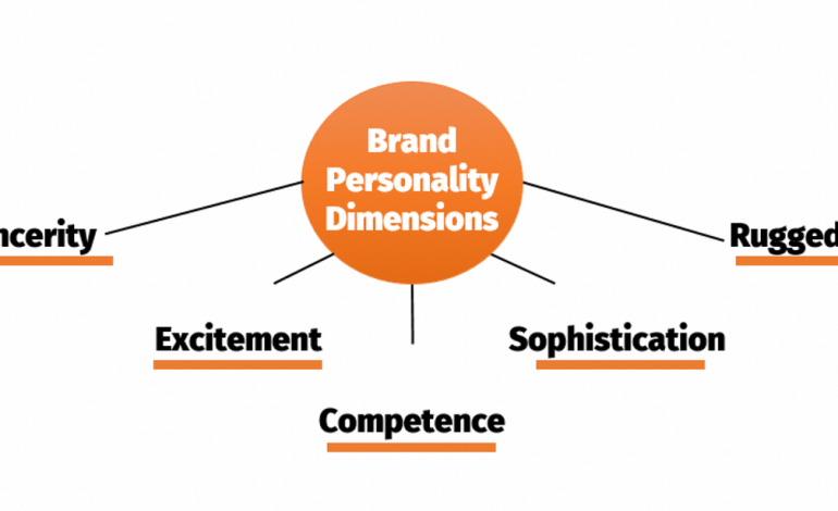
For this purpose, you’ll need to first define your brand identity. A recommended practice for this is to compose a list of adjectives that describe your company’s character and personality as if you were talking about a person. Ask yourself how you’d like the brand to be perceived, and what sets it apart from the competition.
The following spectrum of brand identity traits is key for building a brand, and can help you pinpoint the core of your brand more easily:

2. Explore color meanings
Now that you’ve identified your brand personality, it’s time to choose the colors to make it shine through. In doing so, it’s worth looking into color theory and color psychology principles for common color meanings. You can also research using a color picker.
However, it’s also important to mention that color is not an exact science, and there’s no equation to accurately define which color means what and how your target audience will experience it. This is where color combinations come in, as they help in achieving a look that evokes certain stimuli and feelings through their juxtaposition.
To understand this, think of the difference in the meaning of the color blue when it’s paired with gold – conjuring notions of royalty and luxury – as opposed to the same blue, but paired with pink – which tends to feel much more playful.
Colors can mean different things depending on the colors they’re paired with, as well as on context and cultural connotations. Even color terms, the descriptions by which we identify colors can vary by culture. There are, however, clear trends in color use based on industry.
To help you choose the right color palette for your business, here’s a quick breakdown of popular brand colors by a few main industries:
- Food: Many food and restaurant businesses opt for warm colors that draw attention and evoke appetite, such as red, orange and yellow. Other food brands choose green to promote a connection with nutrition and well-being, or blue and pink for sweets and desserts.
- Health and wellness: Most health and wellness companies choose blue to signify cleanliness, trustworthiness and responsibility. Other popular options are green, representing nature and wholesomeness, and orange, which can bring up ideas of vitality and energy.
- Fashion and beauty: The fashion and beauty industries often use black for sophistication and glamour, and warm colors such as red, orange and pink for passion, confidence and excitement.
- High-tech: Tech companies most commonly go for blue, which symbolizes feelings of trust, intelligence, and efficiency. Additional colors are orange, which is friendly and optimistic, and purple, which stands for quality and creativity.
These colors aren’t just popular in these industries, but in many others as well. For example, construction companies often use blue too because it conveys a sense of professionalism and competence. Try using a construction logo maker to explore the colors you can use.
3. Search for inspiration
As a final step before crafting your brand colors, look around for color inspiration. Browse through your competitors’ palettes, and try and understand what it is that makes them work well. Think of what you can learn from their color choices, and of ways in which you can differentiate yourself from the competition.
Other great sources of inspiration are online color palette generators, where you can find ideas for interesting color pairings and mesmerizing shades. You can also explore these logo color ideas for some inspiration.
You can also consider conducting market research. This means looking at all the brand color options you want to explore, and taking them to focus groups for feedback. How do people actually respond to those colors and how can you connect that emotion with your brand identity? You can also take away from these groups, color preferences by demographic.
4. Pick your primary color
Your brand’s primary color, or core color, is the one most associated with your brand. Think of the signature Tiffany’s Blue or Pinterest’s red.
For your primary color, look for a single color that best embodies your business based on color meanings. You can experiment with different shades and tints of the color you have in mind, going from lush and dark to soft and pastel, or even bright neon, in order to find the perfect look.
5. Choose your secondary colors
Once you have your primary color, pick two to four colors to go along with it. These colors will compliment your primary one, and can either appear next to it or independently. A brand’s secondary colors can go in a few different directions:
- Analogous color scheme: These are close variants of your primary color. This means that if your primary color is bright red, you can add other warm colors (such as orange and yellow) that belong to the same color family. Analogous color schemes are usually harmonious and pleasant in their appearance.
- Monochromatic color scheme: These are different shades and tints of your primary color. For example, if your primary color is blue, your secondary colors can be light blue and dark blue. Monochromatic color schemes can strengthen and enhance your core color.
- Contrasting color schemes: Contrasting colors are either complementary colors (seated across from each other on the color wheel), or a selection of colorful, equally-vibrant hues. This color scheme can help your brand colors pop and usually give off a fun and modern feel.
6. Select neutral colors
When crafting your brand colors, it’s easy to focus on the main colors and overlook the neutrals. However, neutral colors are important as they are the ones in charge of most of your communication (such as the color of your written text) and will appear in the background of most of your assets.
Neutral colors are usually white or black, often combined with a few shades of gray.
7. Test your brand colors
Once you’ve picked your colors, place them all together and test them in a few different combinations to make sure they complement one another, and convey the message you were aiming for.
Read Also: Value Tagging: A New Attention Model For Brands
In order to make your website accessible, you should also test your palette for in order to make sure that they’re clearly legible together. There are plenty of online resources and browser plugins that test color contrast for accessibility. Contrast Checker and Colour Contrast Analyser are two such tools that we recommend.
Inspirational Brand Colors That Work
1. Starbucks
Starbucks’ brand colors are based on a family of greens, combined with four neutral colors. Their primary color is that of the Siren logo – an iconic shade referred to as “Starbucks Green.”
The expanded color palette merges this primary green, alluding to the brand’s rich heritage, with other “fresh and inviting” hues. These include an accent green and two secondary greens.

2. Instagram
The Instagram brand colors are a gradient of blue to yellow, with a wide range of purples, pinks and oranges in between. This gradient is a reinterpretation of the brand’s rainbow from its earlier, skeuomorphic logo.
This rich color spectrum is meant to evoke feelings of “warmth and energy.” It’s also a tribute to the importance of color in the app’s filters, community uploads, and more.

3. Slack
Slack’s color palette is just as refined as it is playful. It features four primary colors – white, black and two shades of aubergine purple. Accompanying those are blue, green, yellow and red, serving as accent colors.
In Slack’s case, it’s the accent colors that take center stage in the logo, and not its primary aubergine. Coming together to form an octothorpe, the four colors bring to mind notions of teamwork and collaboration.

4. The Guardian
The Guardian is most associated with its navy blue and bright yellow shades. Yet for a platform this rich in content, colors take part in more than brandability alone. They also serve as a navigational tool, by distinguishing between types of editorial content.
For example, red marks news articles, orange is for opinion pieces, and brown is for cultural topics. Each of these colors comes in a selection of variants, depending on their application: dark, main, pastel and faded. These allow for flexibility in color use.

5. Google
Google has one of those timeless logo designs that we all know by heart. And just like the design itself, the four colors of the logo (blue, red, yellow and green) are equally synonymous with the company. Those are the brand’s primary colors, along with white which is also predominant in Google interfaces.
The secondary Google colors are darker versions of the primary ones. Those are followed by tertiary light blue and light green, and a range of grays that serve as the neutral colors in delivering information, such as in written text.

6. Lyft
Lyft is well-known for their signature pink. Yet surprisingly, the primary brand palette is composed of white as the main color, followed by black, and only then – the Lyft Pink. This ratio is meant to instill the pink with greater meaning, making it stand out in the times it is used.
The brand’s secondary palette is much more encompassing, including 40 different colors – from greens and yellows to blues and oranges. These are used to support the main brand colors, and take a back seat in crafting their brand identity.

7. Dell
The Dell brand colors are divided into three tiers. The first tier includes the company’s core colors, with the signature Dell Blue as the primary color, giving off a “vibrant and energetic” feel. The three shades of blue act as the foundation to the rest of the palette.
The second tier is made up of three accent colors (purple, berry, and orange) and five neutrals (white and a range of grays). Last is the third tier, which features three additional accent colors. An exception to this palette is black, which can be used for text or in the logo, but not as a design element.
element.

8. Dropbox
Dropbox’s primary brand colors are blue, black and white. But there’s much more to it, as the main focus here is the versatility of different color combinations. Dropbox boasts 18 brand colors that produce a total of 32 different pairings.
Dropbox’s rich color spectrum is intended to generate unique mixes that go together well, leading to “interesting and often unusual combinations.” This unique visual language is achieved through dynamic, mix-and-match variations, rather than through unification and standardization.

9. Mastercard
The Mastercard logo is composed of two overlapping circles, one red and the other yellow, which together produce a bright shade of orange. This same orange is also the company’s primary color, accompanied by two shades of gray (light and dark) as the background colors.
The secondary colors in the Mastercard color palette are gold, yellow and green, and the accent colors are red and teal.

10. Airbnb
There are five Airbnb brand colors. The most prominent among them is pink (called Rausch), which is also the color of the brand’s logo, and is used repeatedly in the company’s website design. The pink is joined by a turquoise shade, an orange, and two grays – dark and light.

Conclusion
Brand color psychology is the study of how colors can affect people’s perception of a brand. Different colors can evoke different emotions and associations, so it’s important to choose brand colors that are aligned with your brand’s personality and values. For example, blue is often associated with trust and reliability, which is why it’s a popular color for brands in the financial and healthcare industries.
When choosing brand colors, it is important to consider the psychology of color. This will help you to choose colors that will evoke the desired emotions and associations in your target audience.