Any business’s lifeblood is its sales. Reducing to the essentials is necessary to maximize the performance of your sales crew. One of the specifics is to make the sales process more efficient. Excel sales pipeline templates are an effective tool for managing your sales process. It can assist in determining which sales stages want improvement and which are operating well.
XYZ Inc. needed to improve its sales procedure since it was confusing and ineffective. They required more understanding of and control over the sales process. To assist them, they built an Excel template for a sales funnel.
How to Create Sales Pipeline in Excel
We first need to gather some fundamental data in order to construct a sales pipeline. With the use of these bits of information and a few simple actions, we can simply make this. We’ll explain these steps in more detail in the next section. Now let’s look at the process for creating a sales funnel in Excel step-by-step.
1. Prepare a Dataset
At the very beginning, we must construct or import our dataset, which includes the necessary data for creating a sales pipeline. Here, we are going to use a report of ABC Organization: Deals of 2021. This dataset contains the Qtr (a quarter of the year), Month names, Region, and different types of status in columns B to I respectively.
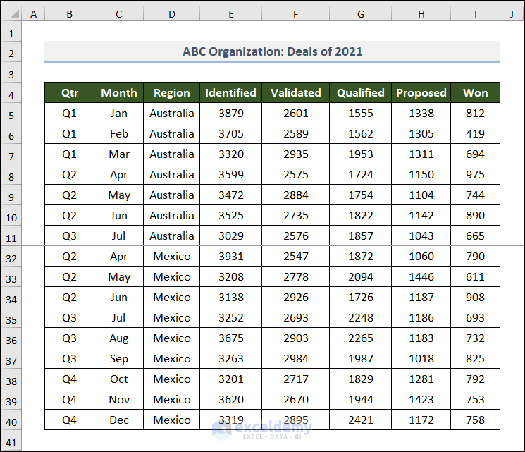
You can notice that this dataset is large in the vertical direction. To accommodate the largest part of the table in the image, we used Freeze Panes in the worksheet.
Our first job is done. Now, let’s go to the second one.
2: Create PivotTable
In this step, we’ll embed a PivotTable from the above-mentioned data table. Allow me to demonstrate the process below.
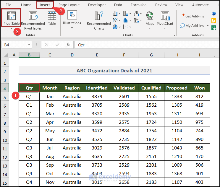
- First, select any cell inside the dataset. In this case, we chose cell B4.
- Then, navigate to the Insert tab.
- After that, click on PivotTable on the Tables group of commands.
Immediately, the PivotTable from table or range dialog box appears before us.
Here, you can see the whole dataset is selected automatically. But double-check manually to avoid any unwanted mistakes.
- Then, select New Worksheet in the Choose where you want the PivotTable to be placed section.
- Later, click OK.
Instantly, you can see this PivotTable in the new worksheet.
- Then, click on any cell inside the PivotTable area and you can find the PivotTable Fields task pane on the right side of the display.
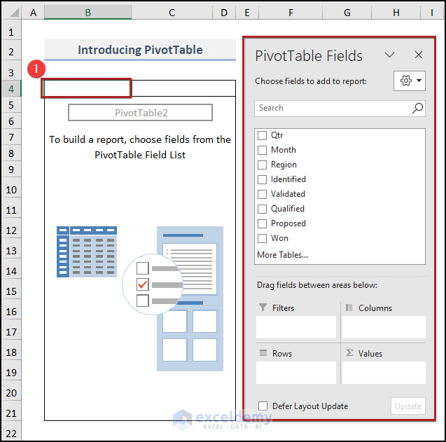
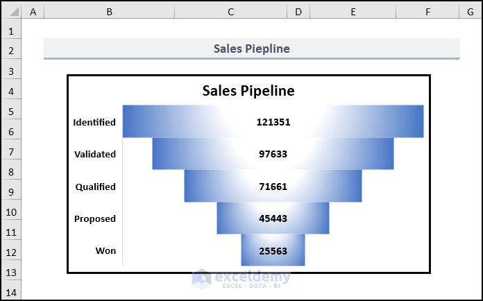
Now, check the boxes of Identified, Validated, Qualified, Proposed, and Won. Excel will automatically place these fields into the Values area.
Read Also: Which is The Best Way to Generate Sales Pipeline?
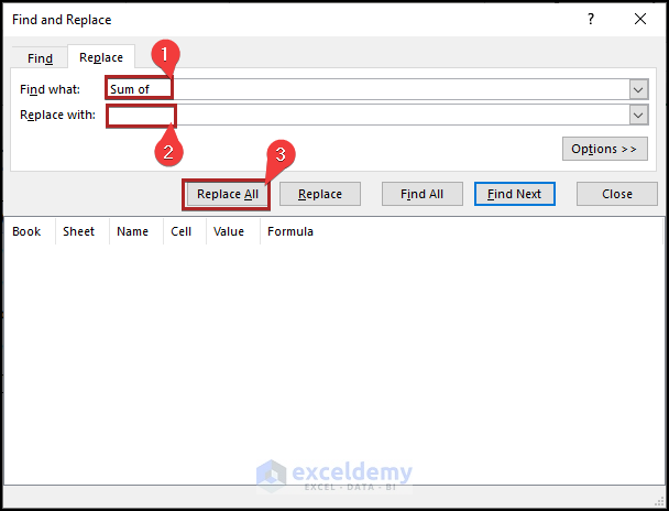
But we want to see the field name, like Identified, Validated. Not at all like the Sum of Identified. To do this, we should replace them.
- So, tap CTRL + H on your keyboard to bring up the Find and Replace wizard.
- In the Find what box, write down Sum of.
- Also, keep the Replace with box blank.
- Then, click on the Replace All button.
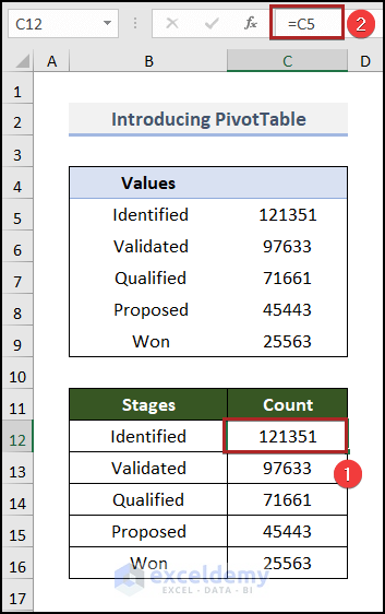
3. Copy Values from PivotTable
Now, we have to copy these values from the PivotTable to somewhere else as we cannot insert a chart from this table. Let’s see the process in detail.
- Firstly, create a new table in the B11:C16 range with two columns Stages and Count.
- Secondly, go to cell B12 and enter the following formula.
=TRIM(B5)
Here, B5 represents the first text string in the PivotTable. The TRIM function removes the extra spaces from the text string in cell B5.
- Thirdly, press ENTER.
- At this time, bring the cursor to the right bottom corner of cell B12 and it’ll look like a plus (+) sign. Actually, it’s the Fill Handle tool. Consequently, drag this tool up to cell B16.
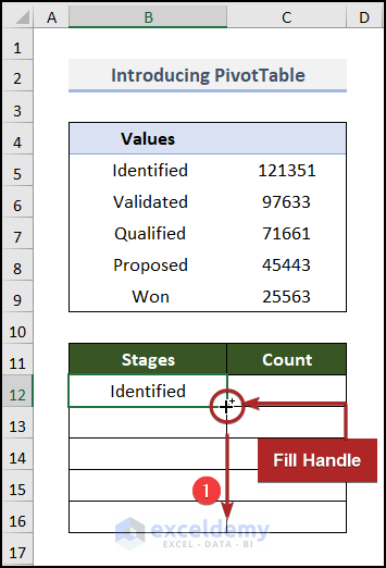
Instantly, Excel copies the formula to the lower cells and as a result, they get results inside them.
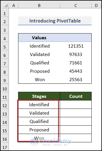
- Again, jump to cell C12 and insert the following formula.
=C5
This formula simply fetches the value from cell C5 to cell C12.
- As always, press ENTER.
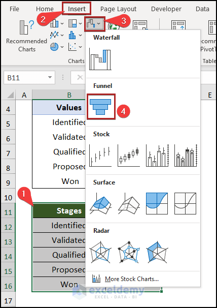
4. Insert Funnel Chart
Here comes the most interesting part of the article. Now, we’ll insert a chart to complete our objective properly. So, without further delay, let’s dive in!
- Primarily, select cells in the B11:C16 range.
- Then, advance to the Insert tab.
- After that, click on the Insert Waterfall, Funnel, Stock, Surface or Radar Chart drop-down icon on the Charts group.
- Next, choose the Funnel chart from the drop-down list.
Suddenly, it’s before our eyes.
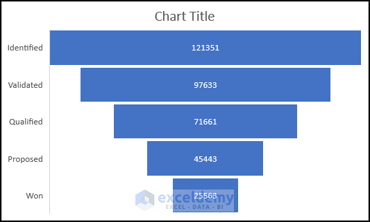
- Following this, give a suitable chart title and make the axis labels bold and a bit bigger.
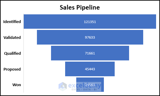
- At this moment, select the chart and press CTRL+X on your keyboard to cut it and paste it into a new worksheet named Pipeline using the CTRL+V shortcut.
Now, you must be thinking about how the color gets changed and the chart gets a shiny look. Don’t worry! It’s so simple.
- Firstly, right-click anywhere on the bar of the chart.
- Then, from the context menu, select the Format Data Series option.
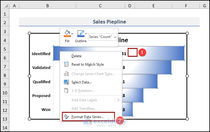
Immediately, a Format Data Series task pane will be exhibited on the right side of the display.
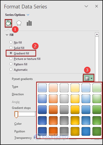
- Secondly, click on the Fill & Line icon.
- Then, select Gradient fill under the Fill section.
- Later, click on the Preset gradients drop-down icon. And you can choose whatever style you like from the available options.
Now, we’ll insert some slicers to get more control over the chart and to make it dynamic.
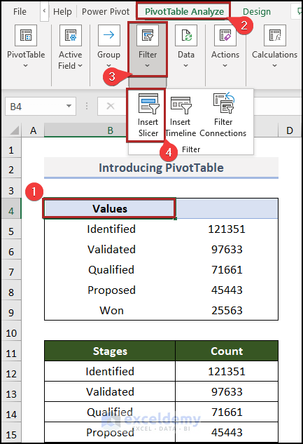
- Right now, get back to the PivotTable worksheet.
- Then, click anywhere inside the PivotTable.
- After that, proceed to the PivotTable Analyze tab and click on the Filter group of commands.
- Later, select the Insert Slicer command.
Abruptly, the Insert Slicers dialog box will pop up.
- Forthwith, check the boxes of Qtr, Month, and Region and click OK.
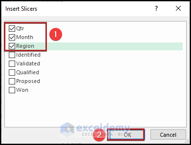
As a result, we can see three different slicers in the spreadsheet.
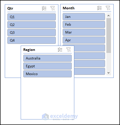
- Then, select them all and cut them from this sheet. And, paste them into the Pipeline worksheet.
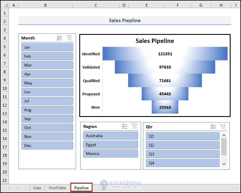
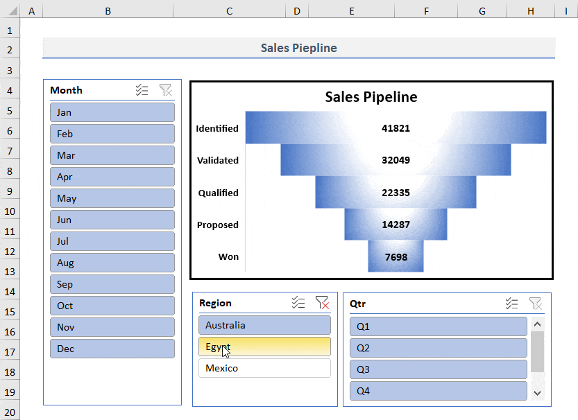
- Next, observe the steps in real-time in the animated GIF below to feel the dynamism of this chart.
Best Charts Used in Sales Pipeline Report
There are various charts and graphs you can use to create a sales pipeline report. Some of the most popular charts used in sales pipeline reports are:
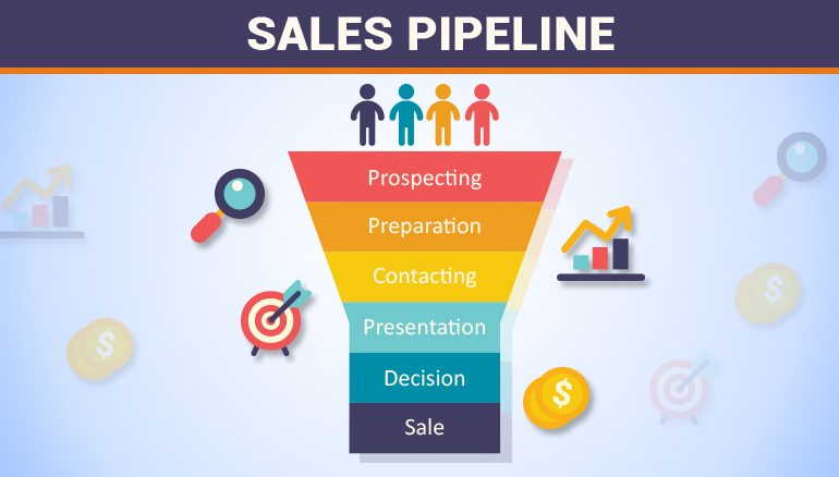
- Funnel Chart
A funnel chart is great for analyzing the sales process and determining the main challenges affecting sales. It can help you see which stage of the sales cycle is taking longer than expected and why. And with the use of a package called ChartExpo, creating attractive funnel diagrams like the one below is simple.

- Bar Chart
A bar chart is another useful one to create a sales pipeline report. It allows you to see different sales metrics, such as the number of leads received, the number of sales made, etc. Each stage of your sales process is represented by a horizontal slice that runs the length of the visualization. To build a sales pipeline, utilize a stacked bar chart like the one below.

Sales forecasting is another approach to looking for gaps. Periodic sales predictions show whether you’ll miss, reach, or exceed a monthly or quarterly goal if you’re working toward one (which you should be). Alternatively, Waterfall Chart effectively increases the overall value of the opportunities currently in your pipeline (as well as qualified leads, if you’d like) by the likelihood that those deals will close.

Alternatively, Sankey charts can be used to display the proper customer flow.

You know that having a sales pipeline is crucial if you want to expand your clientele and scale your company. However, if you’re starting a business, you might not need to invest in new tools, like a CRM. Even if you just plan to work with your first ten clients, you still need a mechanism to keep track of your prospects and the agreements being considered.
You can create an accurate sales pipeline report in various ways that might not cost you a dime. Are you looking for a free sales tracking tool? Try using the Excel sales pipeline report template. In this manner, you can arrange your company while you create your first website.
However, Excel’s limited data visualization capabilities can only partially assist you in understanding the data from your slope chart, and your time is valuable.
Using a data visualization tool like ChartExpo is simple enough. Instead of providing hundreds of connectors that only extract a small number of datasets, you can use the ChartExpo for chart add-in for Excel to create interactive charts in excel like Sankey Chart, Waterfall Chart, and Funnel Chart with only a few clicks and without any scripting, giving your audience access to crucial insights at a glance.
Let’s say you have sales data for your business and want to examine the sales funnel with the data below:
| Leads | Pitched | Consideration | Close | Retarget | Size |
| Lead | Opportunity | Qualified | Sold | Customers Retained | 140 |
| Lead | Opportunity | Qualified | Sold | Customers Retained | 232 |
| Lead | Opportunity | Qualified | Sold | Customers Retained | 213 |
| Lead | Opportunity | Qualified | Sold | Customers Retained | 215 |
| Lead | Opportunity | Qualified | Sold | Customers Retained | 142 |
| Lead | Opportunity | Qualified | Sold | Customers Lost | 258 |
| Lead | Opportunity | Qualified | Sold | Customers Lost | 547 |
| Lead | Opportunity | Qualified | No Sale | 123 | |
| Lead | Opportunity | Qualified | No Sale | 214 | |
| Lead | Opportunity | Qualified | No Sale | 305 | |
| Lead | Opportunity | Qualified | No Sale | 369 | |
| Lead | Opportunity | Qualified | No Sale | 142 | |
| Lead | Opportunity | Not Qualified | 334 | ||
| Lead | Opportunity | Not Qualified | 120 | ||
| Lead | Opportunity | Not Qualified | 344 | ||
| Lead | Opportunity | Not Qualified | 109 | ||
| Lead | Opportunity | Not Qualified | 324 | ||
| Lead | Opportunity | Not Qualified | 218 | ||
| Lead | Rejection | 292 | |||
| Lead | Rejection | 325 | |||
| Lead | Opportunity | Qualified | Sold | Customers Retained | 413 |
| Lead | Opportunity | Qualified | Sold | Customers Retained | 284 |
| Lead | Rejection | 355 | |||
| Lead | Rejection | 396 | |||
| Lead | Opportunity | Qualified | Sold | Customers Retained | 82 |
| Lead | Opportunity | Qualified | Sold | Customers Retained | 150 |
| Lead | Opportunity | Qualified | Sold | Customers Retained | 278 |
| Lead | Opportunity | Qualified | Sold | Customers Retained | 202 |
| Lead | Opportunity | Qualified | Sold | Customers Retained | 398 |
| Lead | Rejection | 429 |
- To get started with ChartExpo add-in for Excel, install it.
- Then install ChartExpo. After installing ChartExpo, select My Apps from the INSERT menu.

- Choose ChartExpo from My Apps, then click Insert.

- Once this add-in has loaded, a list of available charts will appear. Sankey Chart is the first item on the list.

- Click “Create Chart From Selection” after selecting the data from the sheet.

- After selecting “Create Chart”. You may get the final look as seen below after adding colors, adding headings, and changing various properties in the visualization.

Insights
This sort of chart lets you assess the sales of your business and can help you expand your company to achieve the highest potential ROI. You can quickly see the sales pipeline of the company from this chart, which can help you optimize your firm’s products.
Your sales process is represented visually by a sales pipeline. You can track your sales team’s progress throughout the entire sales cycle with its help. The sales pipeline can also be used to forecast how much money your business will make in a given time frame.
You can find out which step of the sales process is taking longer than anticipated and why by using the sales pipeline. It can also be used to determine the necessary actions to advance sales.
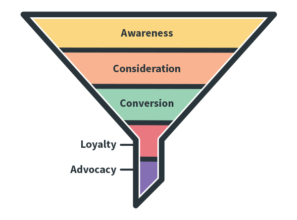
A sales pipeline outlines the process a client goes through and the interactions your sales and marketing team has with them at each level. However, unlike sales pipelines, a sales funnel illustrates the customer’s journey from initial encounter with your brand to decision-making.